Where the U.S. middle class has gone
There are a couple of graphs which explain the phenomenon of why the middle class has been shrinking and people seem poorer (because relatively THEY ARE). So while Americans are more productive (it's more than doubled since the 70s), wages have stagnated, meaning that people are producing more but not making more money. 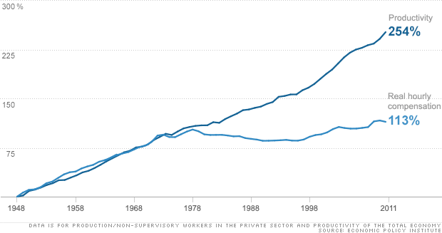 That's the first graph, but these others are also pretty revealing. Basically, where has the money then gone if productivity is going up but wages aren't? Who's getting the extra value? THE RICH. So as can be seen from the graphs below income has risen only modestly for almost all Americans but has increased dramatically for the top 1%.
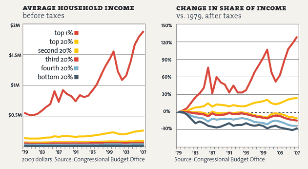
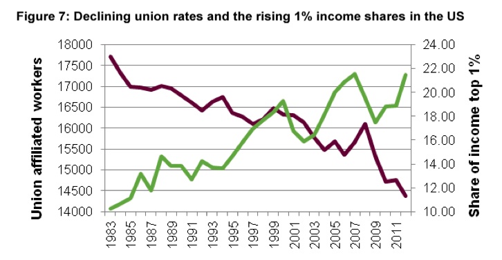
 Lastly, it's worth mentioning that the power of workers, namely organizing together to form unions, may also have an effect. One thing is certain, unions have been getting absolutely smashed by big business. Feel free to leave a comment or if you want more cool graphs, check out the link to this cool article from Mother Jones. http://www.motherjones.com/politics/2011/02/income-inequality-in-america-chart-graph